


In modern website design and development, focusing solely on beautiful images or standard code structure is not enough. User experience (UX) and effective content presentation are the decisive factors in whether a website retains readers and achieves good conversions.
One of the important tools to help you understand user behavior is the heatmap. This tool not only provides a visual insight into access behavior but also strongly supports optimizing content presentation, navigation, and CTAs on the page.
What is a Heatmap?
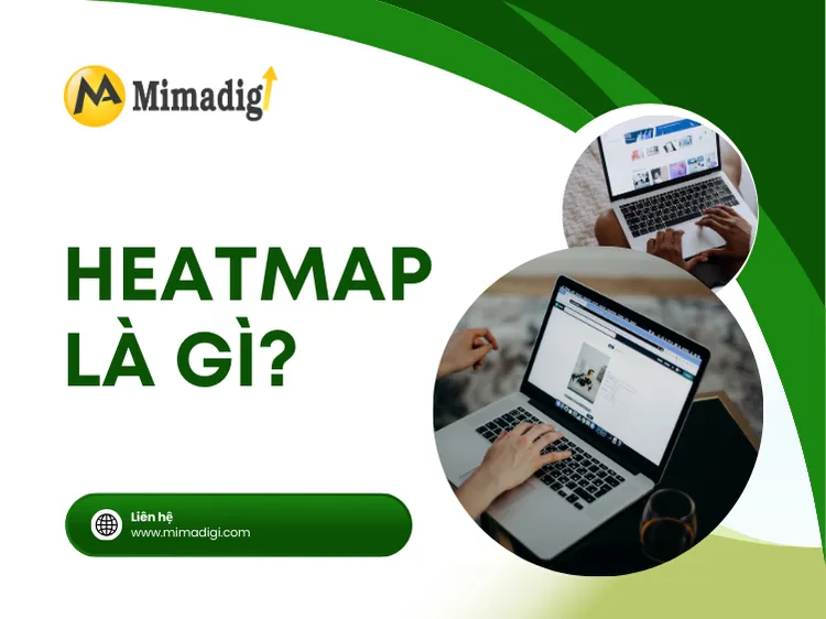
A heatmap is a tool that represents user behavior when accessing a website, using colors:
Red – orange – yellow: areas where users interact the most
Blue – gray: areas that receive little attention
There are 3 common types of heatmaps:
| Heatmap Type | Description |
| 🔍 Click Map | Shows areas where users click the most |
| 🧭 Scroll Map | Shows how far users scroll down the page |
| 🖱 Move Map | Tracks mouse movements on the page |
👉 Heatmaps help you know exactly which content users view, read, and interact with the most – thereby improving layout and content scientifically.
Why are heatmaps important in content presentation?
Any website has a goal: to provide information – retain readers – lead to action (CTA). However, in reality, users do not always read from top to bottom. Heatmaps will help you:
✅ Know where users pause the most
✅ Know which content is ignored
✅ Detect parts that hinder reading
✅ Optimize internal navigation
✅ Place CTAs in easily visible locations
🎯 By understanding how users actually “read” a website, you can present content effectively.

Popular Heatmap Tools
Below are popular and easy-to-use heatmap tools:
| Tool | Key Features | Free / Paid |
| Hotjar | Heatmap, Record session, Feedback popup | Free version available |
| Microsoft Clarity | Heatmap, session recording | Completely free |
| Crazy Egg | Heatmap, A/B test | Paid |
| Lucky Orange | Heatmap + live chat | Paid |
👉 Microsoft Clarity is a great choice if you're just starting out – free and easy to install.

How to use heatmaps to improve content presentation
Start with high-traffic pages
Don't need heatmap for entire website, focus on:
- Homepage
- Product/service pages
- Top-traffic blog posts
- Advertising landing pages
🎯 These are the pages that have a big impact on the conversion rate → need to improve the content first.
Observe scroll map – improve layout
The scroll map shows how far the user stops reading and which part they skip.
📌 Detection:
- Content is too long → user does not scroll to the end
- CTA is too late on the page → no one sees it
📌 Solution:
- Put important information (CTA, USP) higher
- Divide long content into clear sections with subheadings
Based on the click map – optimize links and CTAs
The click map shows where users click the most:
- Menu → which item is of interest?
- Banner → does anyone click?
- Contact button → does anyone interact?
📌 Detection:
- Important CTA but no one clicks → needs to be redesigned
- Users accidentally click because the button looks like a link → needs to be modified
📌 Solution:
- Increase the prominence of CTAs (color, size)
- Move the CTA to a high-interaction area
Track mouse behavior (move map) – adjust presentation
The move map helps you know which direction the user's eyes follow, which area “attracts attention”.
📌 Detection:
- Title is too long → readers skip it
- Paragraph without highlights → being skimmed
📌 Solution:
- Shorten the title, bold the main keywords
- Use bullet points, information boxes, illustrations
Sample Process for Improving Content with Heatmaps
Step 1: Install heatmap (Hotjar / Clarity) on the website
Step 2: Monitor for 7 – 14 days for sufficient data
Step 3: Identify pages that need improvement (high bounce rate, low time on page)

Step 4: Analysis:
- Scroll map: how far do users scroll?
- Click map: how much/little do they click on?
- Move map: where do their eyes stop?
Step 5: Note areas that need optimization:
- Move the CTA higher
- Add illustrations to sections being skipped
- Cut long paragraphs into bullet points
- Place internal links immediately after important sections
Step 6: Apply changes → Monitor again after 1–2 weeks
Common content presentation errors “exposed” by heatmaps
| Presentation Error | Impact |
| Important content placed too late | Users don't see it, skip it |
| Unremarkable CTA | No one clicks → loss of conversion |
| No subheadings (H2, H3) | Readers skim without understanding |
| Long paragraph, no line breaks | Causes eye strain, quick page exit |
| Using image banner but no link | Users click but nothing happens → disappointment |
🎯 Heatmaps help you see each problem clearly and visually, without having to guess.
Who should use heatmaps?
Heatmaps are suitable for:
✅ Business owners with websites but low conversions
✅ Marketers running advertising landing pages
✅ SEOers looking to increase time on page
✅ Copywriters optimizing content based on reader behavior
✅ UI/UX teams need to demonstrate hot spots on the interface
Content Presentation Optimization Service Based on Heatmap at MIMA
You don't need to learn how to install and read heatmaps yourself – MIMA will help you from A–Z:
✅ Install Hotjar, Microsoft Clarity into the website
✅ Monitor real user behavior
✅ Analyze heatmap data + record session
✅ Suggest improvements to content layout
✅ Redesign the presentation to help retain readers
✅ Attach the correct CTA, in the correct position with conversion potential
🎯 Each small improvement in presentation = a big step forward in conversion rate.
Ineffective content presentation is one of the main reasons leading to high bounce rates and low conversions. And the heatmap is the “third eye” that helps you see what Google Analytics cannot display – the real behavior of users.
If you really want to optimize content presentation to increase experience and conversion rates, start with heatmaps. Easy to install, simple to track, and the results are very clear.
Contact Information
MIMA TRADING AND SERVICE COMPANY LIMITED
📍 Address: Hoc Mon, Ho Chi Minh City
📞 Hotline/Zalo: 0909 035 333
📩 Email: info@mimadigi.com
🌐 Website: https://mimadigi.com


Share your review