


Responsive Website Design for All Devices – Optimize User Experience and Increase Online Business Efficiency
Responsive Website Design – An Inevitable Trend in the Digital Age
In an era where internet users access with various devices, from smartphones, tablets to laptops and smart TVs, building a website that can automatically adjust the interface to display well on all screen sizes is a must. This is why responsive website design has become the new standard, helping businesses, individuals or organizations provide the smoothest, most consistent and professional user experience.

What is a responsive website?
A responsive website (also known as adaptive web design) is a web design technique that allows the website's interface and content to automatically adjust to fit the screen size and device the user is using. A website responsive will be able to:
- Automatically scale content, images, display frames according to each device
- Hide or rearrange the layout to be the most pleasing to the eye
- Maintain the user experience on all platforms
- Easy to use with touch, drag, scroll operations on phones and tablets
Benefits of responsive website design for all devices
- Improve user experience, keep customers on the website longer
- Increase the conversion rate from visits to actions (ordering, filling out forms, contacting...)
- Optimize the effectiveness of marketing campaigns such as Google Ads, Facebook Ads
- Increase SEO ranking because Google highly appreciates mobile-friendly websites
- Save costs instead of making 2 separate versions for desktop and mobile
- Easy to maintain and update content because only one source code is used
- Reduce bounce rate thanks to fast and clear display

Device usage situation in Vietnam and the world
According to the latest statistics, more than 70% of users in Vietnam access the internet using mobile phones. In fields such as e-commerce, services, and tourism, this number can be up to 80%. Globally, the mobile-first trend is growing strongly.
If your website does not display well on mobile, you are losing a large number of potential customers.
Elements required in responsive website design
- Flexible interface (fluid grid): columns and rows are programmed to expand and contract based on percentages instead of fixed values.
- Automatically scaled images (flexible images): images will change size to fit the screen without being broken or distorted.
- Media queries: CSS code used to apply different display formats for each type of device.
- Change the appropriate layout: rearrange UI components (menus, buttons, forms...) for easy use on phones.
- Responsive menu: switch to "hamburger" icon or drop-down form to save space.
- Font that is easy to read on mobile, large touch spacing to avoid confusion.
- Priority content display: important parts need to be placed at the top on mobile.
Fields that need to prioritize responsive website design
- E-commerce: online shops, fashion, cosmetics, electronics
- Services: spa, dental, law, transportation, tourism
- Education: schools, training centers, online tutors
- Real estate: projects, brokerage, consulting
- Restaurants – eateries: online menu, table booking
- News: newspapers, personal blogs, online magazines
- Advertising landing pages
Common mistakes when not designing responsive
- Content overflows the screen on mobile
- Text is too small, you have to zoom in to read
- Small buttons are difficult to operate on touch screens
- The website loads slowly, heavy images are not optimized for 3G/4G
- The menu does not display correctly or is confusing
- Customers leave the page due to poor experience

Responsive and SEO-friendly website design
Google prioritizes displaying mobile-friendly pages in search results. Website responsive meets the criteria of SEO such as:
- Fast page loading speed on mobile devices
- Good user experience, low bounce rate
- Clear HTML structure, easy to crawl by Googlebot
- Do not use flash or elements incompatible with mobile
- Links and buttons are large enough and spaced far enough apart to be easily pressed
- Optimize headings and content by device
Technologies commonly used to build responsive websites
- HTML5, CSS3: basic for all responsive platforms
- Bootstrap Framework: supports grid layout, media queries, responsive component
- Flexbox, Grid layout: create modern and easy-to-adjust layouts
- JavaScript / jQuery: handle some custom effects
- CMS such as WordPress, Joomla, Shopify: most support responsive templates
Responsive website design process at MIMADIGI
- Free consultation according to business needs
- Brainstorm interface ideas based on industry and target audience
- Design UI/UX demo templates
- Responsive programming with full features as required
- Optimize page loading speed, security, and SEO standards
- Test on many real devices: Android, iOS, tablet, PC, Mac
- Hand over the website and provide management instructions
- Provide long-term maintenance, upgrades, and updates

MIMADIGI – Professional Responsive Website Design Partner
With many years of experience and a team of programmers – interface designers with in-depth understanding of user behavior, MIMADIGI has implemented hundreds of responsive website projects for customers at home and abroad. We are committed to providing solutions:
- Displays well on all devices from low-configuration phones to high-end iPhones
- Fast, user-friendly and easy to operate
- Synchronize brand images on all platforms
- Optimal cost, long-term technical warranty
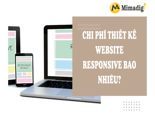
How much does responsive website design cost?
Depending on the scale and feature requirements, the price of website design responsive can range from 5 million to 30 million VND. Factors affecting costs include:
- Template interface or exclusive design
- Basic or advanced features (online payment, API integration...)
- Number of pages, articles, images
- Requests to integrate additional tools such as chatbot, blog, booking
- Included hosting and security package
Contact information:
MIMA TRADING SERVICE COMPANY LIMITED
Tax code: 0318672839
Address: Hoc Mon, Ho Chi Minh City
Hotline/zalo: 0909 035 333
Email: info@mimadigi.com


Share your review