


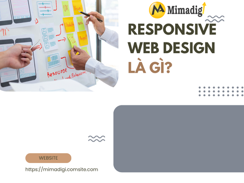
In the digital age, users access websites from various devices such as computers, phones, and tablets. Therefore, having a website that can display flexibly – also known as Responsive Web Design – has become a mandatory requirement if you want to attract and retain customers effectively.
So, what is Responsive Web Design? Why do businesses need to apply responsive web design? Let's explore with MIMA Trading and Service Co., Ltd. in the article below!

What is Responsive Web Design?
Responsive Web Design (RWD) is a website design method that helps the interface and content of the website automatically adjust to fit the screen size of each access device – from desktops, laptops to tablets and smartphones.
Instead of creating multiple separate website versions for each type of device, a responsive website uses HTML, CSS, and media queries to customize layouts, images, fonts, and features... to optimize display on all devices.
Benefits of Responsive Web Design
Responsive Web Design brings a lot of value to both businesses and users. Here are the benefits you cannot ignore:
✅ Optimal display on all devices: Whether users access from phones, tablets, or laptops, the website still maintains a clear layout, sharp images, and easy-to-read content – helping to create a consistent and professional experience.
✅ Improve user experience (UX): Responsive websites help users easily find information, operate smoothly, avoid zooming in/out or scrolling horizontally – thereby increasing satisfaction and retaining visitors longer.
✅ Increase conversion rate
A website that displays well will:
- Increase access time.
- Reduce bounce rate.
- Increase the likelihood that customers will take actions such as making purchases, filling out forms, making phone calls, etc.
- All of which help increase conversion rate.
✅ Optimize SEO & improve ranking on Google: Google prioritizes ranking websites that are mobile-friendly. Responsive design is one of the important factors that help websites rank high in search results.
✅ Save costs and easy to manage: You only need to manage one website version, instead of having to build and update many different versions for each device. This helps reduce time, effort, and maintenance costs.
Why is Responsive Design increasingly important?
The boom of mobile devices has completely changed user behavior:
- More than 70% of traffic comes from mobile.
- Users tend to search and buy directly via phone.
- Google has switched to Mobile-First Indexing: Prioritizing the mobile version to evaluate rankings.
Therefore, if your website does not display well on phones, you are losing thousands of opportunities to reach potential customers every day.
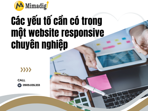
Elements to have in a professional responsive website
To design a website effectively responsive, you need to pay attention to the following technical and experience factors:
🔹 Use Fluid Grid Layout: Fluid grid helps elements on the website stretch or contract depending on the screen size, instead of having a fixed size. Everything is calculated as a percentage instead of pixels, helping the layout to always be balanced.
🔹 Flexible Images: Images need to automatically adjust in size without being broken or distorted when displayed on small devices.
Solution:
- Use CSS max-width: 100%.
- Use optimized image formats (WebP, SVG).
🔹 Media Queries: Media queries are the core of responsive design, allowing you to adjust CSS according to each screen resolution.
🔹 Easy-to-read font: The font size must be large enough on a small screen, the line spacing is reasonable, avoid fonts that are too thick or too thin.
🔹 Optimize buttons (CTA) for touch devices
- Buttons are large enough to be easily pressed.
- Reasonable spacing between buttons.
- Don't use hover too much (because mobile devices don't have a mouse).
🔹 Appropriate navigation menu
- On mobile, the menu is often collapsed into a hamburger shape.
- Can slide horizontally or appear full screen when pressed.
Common mistakes when designing a responsive website
Many businesses misunderstand responsive and make the following mistakes:
❌ Designing mobile like a "miniature version" of the desktop: Responsive is not simply shrinking the interface – it's about optimizing the layout, content, and experience for each device.
❌ Ignoring page load speed: If the website is beautiful but loads slowly on mobile, users will leave immediately. Need to compress images, use strong hosting, and optimize the source code.
❌ Not checking on enough devices: You need to check the website on many different types of devices, browsers, and operating systems to ensure that there are no interface errors.
Responsive website design process at MIMA
At MIMA Trading and Service Co., Ltd., we build websites responsively according to a professional process, optimized from interface to speed and SEO:
🔧 Step 1: Consulting & analyzing requirements
Clearly understand business goals, target customer groups, products/services.
🎨 Step 2: Interface design (UI/UX)
Create a flexible interface for all devices, ensuring a smooth experience.
💻 Step 3: Responsive programming
Use HTML5, CSS3, standardized media queries for multiple devices.
🧪 Step 4: Multi-platform testing
Test the website on many devices and browsers to ensure synchronization.
🚀 Step 5: Handover & warranty
User manual, technical support and periodic upgrades.

MIMA – Professional responsive website design unit
With many years of experience in the field of website design standard UX/UI, optimizing SEO and responsive, MIMA is a reliable partner of hundreds of large and small businesses in Ho Chi Minh City. Ho Chi Minh City and throughout the country.
🎯 Commitment from MIMA:
- Beautiful interface, compatible with all devices.
- SEO standard optimization, Google friendly.
- Fast page load speed – does not lose customers.
- Long-term technical warranty, periodic upgrades.
- Competitive price – quality exceeds expectations.
In the digital age, Responsive Web Design is not just a trend – it is a mandatory standard if businesses want to compete, reach users effectively and build a strong brand in the online environment.
Let's start by building a website friendly to all devices, standard UX/UI and optimized SEO, to convert visitors into loyal customers.

Contact Info
MIMA TRADING AND SERVICE COMPANY LIMITED
📍 Address: Hoc Mon, Ho Chi Minh City
📞 Hotline/Zalo: 0909 035 333
📩 Email: info@mimadigi.com
🌐 Website: https://mimadigi.com


Share your review