


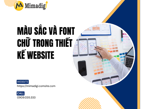
In the field of website design, two factors that directly influence the user's perception when accessing a website are color and font. They not only create an eye-catching appearance but also play an important role in conveying brand messages, creating user experience (UX), and impacting conversion behavior.
So, how to choose colors and fonts appropriately? What principles should be followed when designing a website? Let's explore the details below with MIMA Trading and Service Co., Ltd.!
The Importance of Colors and Fonts in Website Design
🔶 Colors: An Element that Stimulates Emotions and Brand Recognition
Color is one of the first elements that users perceive when accessing a website. It affects emotions, behavior, and brand memory. A suitable color palette will help:
- Increase brand recognition.
- Create harmony and comfort when viewing.
- Evoke emotions consistent with the message conveyed.
- Increase conversion rates if using effective CTA colors.
For example: Red creates a feeling of strength and urgency; blue brings trust and professionalism; yellow expresses brightness and dynamism...
🔷 Fonts: The Main Channel for Transmitting Content
Fonts help users read and access information easily. Suitable fonts will support:
- Conveying clear messages.
- Enhancing user experience.
- Creating a professional and consistent feeling.
Conversely, using fonts that are difficult to read and cluttered will cause users to quickly leave your website.

Principles for Choosing Colors in Website Design
To make your website attractive, professional, and truly reflective of your brand's spirit, you need to follow these principles when choosing colors:
✅ Apply a Brand Color Palette: The website color palette should accurately reflect the brand identity. Including:
- Primary color: The color representing the brand, appearing most often (logo, titles...).
- Secondary color: Supplements to increase harmony.
- Accent/CTA color: Used for buttons, calls to action, prominent icons.
- Background and text colors: Should be easy to read and not cause eye strain.
✅ Use a maximum of 3–5 main colors: Using too many colors will make the website cluttered and inconsistent. It is best to choose:
- 1 primary color.
- 1–2 secondary colors.
- 1 accent color for CTA.
- Neutral background/grayish-white.
✅ Ensure Contrast: High contrast between text and background helps users read more easily. For example:
- Black text on a white background.
- White text on a dark background.
- Check the contrast using a tool like WebAIM Contrast Checker.
✅ Understand the Psychological Meaning of Colors
Each color evokes different emotions. Here are some examples:
| Color | Meaning | Suitable Fields |
| Blue | Trustworthy, peaceful, professional | Finance, technology, healthcare |
| Red | Strong, urgent, dynamic | Discounts, F&B, sports |
| Yellow | Optimistic, cheerful, prominent | Education, children, creativity |
| Purple | Luxury, mysterious, feminine | Fashion, cosmetics, high-end |
| Green | Natural, fresh, developing | Agriculture, environment, food |
| Black | Classy, sophisticated, powerful | Technology, high-end fashion |
✅ Avoid using colors that are too bright or difficult to see: Neon colors or combining strong contrasting colors (red – blue – yellow) can be disorienting. You should choose soft, easy-to-see tones that express professionalism.
Principles for Choosing Fonts in Website Design
✅ Prioritize Easy-to-Read Fonts: Fonts are the main communication channel for content. Should choose:
- Sans-serif: Neat, modern, easy to read (Roboto, Open Sans, Lato...).
- Serif: Traditional, luxurious (Merriweather, Playfair Display).
Absolutely avoid fancy, complex fonts with too much ornamentation (such as Brush Script or Papyrus) unless there is a specific purpose.
✅ Do not use more than 2–3 fonts: Using too many fonts will make the website inconsistent and visually distracting. Suggestion:
- 1 main font for content (body).
- 1 prominent font for headings.
If necessary, add 1 font for emphasis such as quotes, slogans.
✅ Choose fonts that are compatible with Vietnamese: Not all fonts fully support Vietnamese with accents. You should choose fonts that are friendly to Unicode and Vietnamese accents are displayed clearly, such as:
- Google Fonts: Roboto, Nunito, Montserrat, Quicksand.
- Vietnamese fonts: UTM Avo, SVN Gotham, iCiel Raleway...
✅ Ensure reasonable size and spacing: Some suggested rules:
- Title: 24–32px.
- Paragraph text: 14–18px.
- Line height: 1.4–1.6.
- White space between paragraphs helps to make it easy to read and airy.
✅ Use consistent fonts according to the design system: Each website should have a style guide that clearly specifies:
- Which font to use for level 1 and level 2 headings.
- Which font to use for buttons, links, and paragraphs.
- Size, boldness, color, spacing...
How to Effectively Coordinate Colors and Fonts
🎨 Synchronize colors and fonts according to brand personality
For example:
- Young brand: Bright colors + round, modern fonts.
- High-end brand: Black, gold + luxurious serif font.
- Website education: Blue + easy-to-access sans-serif font.
🎨 Use prominent CTAs to increase conversions: The "Register", "Buy Now", "Contact" buttons... need to:
- Prominent colors (red, orange, dark green).
- Bold, clear, easy-to-see fonts.
- Good contrast with the background.
🎨 Take advantage of white space: There should be enough white space between paragraphs, images, and titles to separate information, creating a professional and easy-to-understand feeling.

Mistakes to Avoid When Using Colors and Fonts
❌ Using a too dark background + thin text makes it difficult to read.
❌ Using difficult-to-understand artistic fonts for the main content.
❌ Too many colors and fonts cause eye strain.
❌ Not checking on mobile devices.
❌ Lack of contrast between text and background.
❌ Lack of a clear information hierarchy.
Professional Color & Font Design at MIMA
At MIMA Trading and Service Co., Ltd., we not only design beautiful web interfaces but also:
- Research deeply into user behavior.
- Apply the psychology of color to brand recognition.
- Optimize fonts to increase readability and retain customers.
- Ensure multi-platform compatibility: PC, mobile, tablet.
Each website MIMA designs is built with a logical, synchronous, and consistent color and font system with the brand positioning.
Colors and fonts are fundamental elements in professional website design. If chosen correctly and applied effectively, you will create a website that is not only beautiful and professional but also user-friendly and strongly supports marketing and sales activities.
👉 If you need consulting on UX/UI standard website design, optimized SEO, and colors and fonts that match your brand identity, don't hesitate to contact MIMA today!

Contact Information
MIMA TRADING AND SERVICE CO., LTD
📍 Address: Hoc Mon, Ho Chi Minh City
📞 Hotline/Zalo: 0909 035 333
📩 Email: info@mimadigi.com
🌐 Website: https://mimadigi.com


Share your review